Ever feel that magnetic pull? That irresistible urge to dive headfirst into Figma, wires humming, or to crack open your editor and start banging out those beautiful, reusable components? I get it. That’s where the tangible magic seems to happen—creating something from nothing. But I’ve learned, sometimes the hard way, that the most groundbreaking work on a design system, the stuff that makes it succeed or spectacularly implode, happens long before you draw your first rectangle.
I’ve seen designers and developers, buzzing with excitement, leap straight into the “making” phase. It feels productive, looks like progress. But without the deep, foundational work, it’s like trying to build a skyscraper on shaky ground. It might look okay for a moment, but the cracks will appear, and soon enough, you’re dealing with wobbly chaos. You end up with a “system” that’s just a prettier collection of the same old problems.
Interface & Intent is a reader-supported publication. To receive new posts and support my work, consider becoming a free or paid subscriber.
So, before you even think about naming your first color style or debating rem vs px for your base font size, let’s talk about the often-overlooked, yet utterly crucial groundwork. This is where you shift from just wanting to be a software engineer or designer into someone who strategically builds lasting value.
Note:
I’ll interject some real-world examples throughout this post to give you an idea of how this might play out on a real team, not just theoretically.
To give a little background, I’m currently the sole UX designer on a small custom application team at UK HealthCare (which is an entity within the University of Kentucky). Our team is responsible for building apps for multiple departments throughout the organization. I mean, seriously, we have 30+ active applications running out there and start new projects almost every other sprint.
We had an existing design system in place, but it was primarily a React component library to help us speed up the development process, which it did. I knew we needed to bring it to the next level and really build something that would adapt and scale with our team. I proposed this idea to management (I’ll detail in a later post how to get buy-in from leadership) and was approved to start work on a new and improved design system.
Aligning the Builders: Team & Governance
First things first: who is involved in creating and maintaining this system? Is this your solo endeavor, driven by a personal conviction for consistency? Or are you bringing together a dedicated group: designers, developers, product owners, and perhaps other key stakeholders?
Seriously, define who is on the core team. Who has decision-making authority? How will new components or patterns be proposed, reviewed, and integrated? Nail this down, or prepare for a design system that’s either a ghost town with no clear ownership or a free-for-all leading to more inconsistency. Imagine a “system” where every developer adds their “perfect” variation of a button because nobody clarified the contribution and approval process. It leads to confusion and defeats the purpose. Define your governance model, map out your contribution pathways, and establish a clear process for meetings and decision-making. This isn’t about creating unnecessary bureaucracy but establishing a transparent and efficient operational framework.
Note:
After getting buy-in from leadership, our next decision was who would be on our design system team (which we later dubbed “The Fellowship of the Design System”). Three brave souls volunteered, and we were off to a good start with a good range of frontend, backend, and CMS knowledge. The next step was to determine our governance strategy (for a detailed explanation of different governance models, check out this ZeroHeight post).
It made sense for our team to use a federated model. I took the role of Design System Lead, and the four of us became responsible for representing the needs of our team and product portfolio. We set up a GitHub repo and directed the rest of our development team to submit issues for any ideas they had or bugs they encountered and we would prioritize what needed to be addressed.
Understanding the Landscape: Initial Planning & Discovery
Okay, you’ve identified your team (or you are the team). Now, you need a clear picture of the existing environment. Does a design system, or some earlier attempt at one, already exist? Perhaps it’s an outdated UI kit or a set of “common” styles that developers are hesitant to modify. You need to understand its current state, its limitations, and any existing strengths.
This is where you investigate and listen. Talk to the people who will use and be affected by the design system. What are their biggest frustrations with the current methods for building products? Why do interfaces across different products or features feel disjointed? This isn’t just about cataloging complaints; it’s about unearthing the real pain points and needs. Your goal here is a shared understanding: what is the current state, the primary challenges we’re solving, and what does success look like for our organization? Get those clear goals, desired outcomes, and a rough timeline documented. Everyone needs to be aligned on the objectives.
Note:
At this stage, we had an existing component library to analyze. We documented which of our apps were using the component library and which version of the library it was using. We screenshotted different interfaces across the apps, primarily commonly used patterns like the login screen, data tables, buttons, forms, and inputs. We then pasted them into a shared document (in our case, we used Lucid) to compare them side-by-side (we will do a more in-depth component audit at a later stage).
A few screenshots of different interfaces in different apps. You can see from this zoomed-out view just how different the patterns were.
Next, we identified the key technical, design, and resource constraints. For technical challenges, we knew we would be spending a lot of time in discovery, making technical decisions on tooling, looking into unit and visual testing strategies, and addressing current and future technical debt. For design challenges, we faced finding (or buying a license for) a good design tool and learning more about accessibility guidelines. The resource constraints we faced were balancing making progress on the design system while we continued building new products.
Finally, we documented the outcomes and goals. The most important outcomes we prioritized were normalizing the look-and-feel of our apps, extendablity, ease of use, effective documentation, and most importantly, we had to get buy-in from the developers. We wanted to set up an early feedback loop to make sure we didn’t drift to far from what our developers needed. Our intial set of goals included: prioritizing components, consistency with our existing brands, accessibility, developer experience, and expansive test coverage.
Defining the Rulebook: Design Principles & Guidelines
With a shared vision, it’s time to establish the core principles that will guide every decision for the design system. What are the fundamental, uncompromising tenets that will ensure it meets its goals? Think along the lines of:
Consistency: What aspects need to be consistent, and to what degree?
Accessibility: This should be a non-negotiable baseline. How will you ensure your system supports inclusive design practices?
Scalability: How will the system adapt to future growth and evolving product needs?
Efficiency: How will this system make the design and development process faster and less error-prone?
These principles become your decision-making filter. Then, get more specific with guidelines. How should components be used? What are the rules for theming or adapting components for different contexts? What is the approach to responsive design? And critically: branding. Is there an established brand guide that the design system must adhere to, or is the design system an opportunity to codify and strengthen brand identity? This is also the time to evaluate and select your tooling — your design environment (like Figma), documentation platform (like Storybook or Zeroheight), and any other necessary software. Choose tools that support your principles and workflow. The outcome? A documented set of principles and guidelines that keep the entire system and everyone using it aligned.
Note:
We started by looking at our organization’s mission, vision, and existing brand guidelines to ensure we stayed as closely aligned as possible. We took a look at existing web accessibility guidelines, specifically a ruling passed stating that public hospitals and public health clinics needed to conform to level AA of the WCAG 2.1 criteria.
Ultimately, we decided on three primary principles that would guide everything moving forward:
Accessible: We commit to building experiences that are accessible to everyone, regardless or ability or context. Every user interaction will be designed to meet and exceed accessibility standards, ensuring inclusivity and usability for all.
Simple: We will prioritize clean, minimal designs that remove distractions and help users focus on their goals. By reducing unnecessary elements, we create simple and purposeful interfaces that guide users intuitively.
Intuitive: We will design intuitive experiences that feel familiar and predictable, helping users navigate effortlessly and achieve their goals without a large learning curve. By following established patterns and using clear affordances, we ensure usability is seamless.
Simple document capturing our design principles and guidelines as well as some research to back up decisions.
At this point, we started taking a look at some tooling as well. We had an enterprise license to use Adobe products, but XD just didn’t feel like it had what we needed to really move fast so we leaned towards Figma. Since our tech stack included React, Storybook made sense as a visual guide to our components and would allow for some accessibility and visual testing, and for detailed documentation we stuck with Confluence since it was part of our existing Atlassian suite.
Taking Stock: Component Audit & Prioritization
Now that your principles and guidelines are taking shape, you can start assessing your existing digital products. What components, patterns, and styles are currently used across your applications and websites? Conduct a thorough inventory.
This audit will likely uncover a mix of well-designed elements, problematic patterns, and numerous inconsistencies. Your mission is to identify these inconsistencies and critical gaps. What essential UI elements are missing that cause repeated effort or design deviations? What existing components are redundant or poorly implemented? Then, the crucial step: prioritization. You can’t build or redesign everything at once. I’m a strong advocate for using an impact vs effort matrix here. Which components will deliver the most significant value to users or solve the biggest internal inefficiencies with a reasonable investment of time and resources? This process results in a strategic roadmap, clarifying what to focus on first to achieve early wins and build momentum.
Note:
Now, this was a fun exercise. Seeing so many different interfaces and patterns in production was incredibly eye-opening. Buttons were different sizes and colors. Some were on the left-hand side of the forms, others on the right-hand side. Inputs were of various sizes. Tables of different densities—the list goes on and on.
But we got to work listing out all the components used throughout our applications whether they existed in the component library or not. If they were used more than once and weren’t a one-off pattern, it was included.
The next step was to prioritize. I prefer using the impact vs effort matrix when it comes to making these kinds of strategic decisions. You get a chance to think critically about each component and it gives you something to show leadership and the team on how you plan to tackle the implementation.
Our initial impact vs. effort matrix
Establishing the Core Building Blocks: Design System Foundations
Only now, after all that strategic work, are you truly ready to start defining your system's foundational visual and interactive elements. These decisions should flow directly from your previously established principles and guidelines:
Colors: This is a cornerstone. Don’t just pick your brand colors and stop. Define your primary palette, but also develop comprehensive secondary and neutral colors. Also important, specify semantic colors for states like success, error, warning, and information. Rigorously test all your color combinations for accessibility, ensuring they meet contrast requirements. Consider all states: hover, focus, disabled, and active. Think about a comprehensive color system, not just a collection of swatches.
Typography: If your organization has defined brand typography, that’s your starting point. If not, select typefaces that align with your design principles and brand identity. Define a clear typographic scale, including font sizes, weights, line heights, and guidance on responsive behavior. Typography is the voice of your interface; make it clear and consistent.
Spacing & Layout: These are the unsung heroes of a clean, usable interface. Define your spatial units (e.g., a base 8px grid), margins, padding, and the core elements of your layout system, such as containers and grid structures. How will components be spaced to ensure visual harmony? How will layouts adapt across different screen sizes and breakpoints?
Elevation: Determine how you’ll create a sense of depth and visual hierarchy. Define styles for shadows or other visual cues that help users understand the spatial relationships between different UI elements.
Iconography: If your company has established brand iconography, ensure the design system incorporates and governs its use. If not, select or design a clear, accessible, and visually consistent icon set. Icons should be easily understandable and harmonious with the overall design language.
Note:
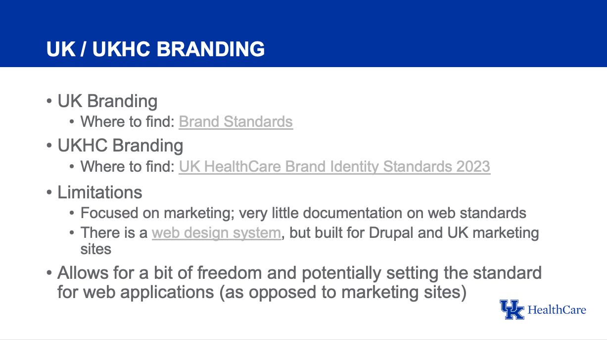
In our case, our organization had two existing brand guidelines. One for the campus side of our organization and another for the healthcare side. They shared a few similarities, but ultimately, they catered to two separate audiences. Since our primary audience were healthcare employees, we made the decision to follow more closely with the branding, voice, and mission of the healthcare guidelines.
Since a design system for building web products hadn’t been publicly attempted yet, we discovered most of the documentation was marketing focused (writing, graphic design, photography, etc.) and we found very little documentation on web standards.
We decided to take this as an opportunity to set the standard for web applications and we would make the decisions we needed to to make the design system as accessible as possible. This meant using the existing standards to build out our color system and making sure the colors looked just as good on the web as they would in a magazine.
A slide from one of our meetings discussing the branding situation.
We spent several meetings discussing and iterating on our design decisions. We had to balance an existing brand with making sure to meet our committment for total accessibility, simplicity, and intuitiveness. When the dust settled, we had our foundations set and could back them up on how they aligned with our key design principles.
A snippet of our document outlining our design decisions and detailing how they aligned with each of our design principles.
Phew. That’s a substantial amount of groundwork. It’s tempting to view these steps as mere preliminaries before the “real” work of designing and coding components begins.
But here’s the perspective that often gets lost: This meticulous, upfront effort isn’t just about avoiding future headaches. It’s the process through which you embed clarity, shared understanding, and strategic intent directly into your product development culture. You’re not just writing down rules; you’re collaboratively defining how your teams will build, what they will prioritize, and how your brand will consistently express itself. In this “before” phase, you translate vision into a practical framework. It’s less about the individual artifacts you create at this stage and more about forging a resilient, shared foundation that will be the true engine of your design system’s long-term success and impact.
Now, take a breath and give these foundational steps the attention they deserve. When their time comes, the pixels will be all the more powerful for it.
Interface & Intent is a reader-supported publication. To receive new posts and support my work, consider becoming a free or paid subscriber.